
- INTERNAL - Bepoz Help Guides
- MyPlace | Backpanel User Guides
- Reports and Reporting
-
End-User | Products & SmartPOS
-
End-User | Stock Control
-
End-User | Table Service and Kitchen Operations
-
End-User | Pricing, Marketing, Promotions & Accounts
- Prize Promotions
- Points, Points Profiles and Loyalty
- Product Promotions
- Repricing & Discounts in SmartPOS
- Vouchers
- Account Till Functions
- Pricing, Price Numbers and Price Modes
- Raffles & Draws
- Marketing Reports
- Accounts and Account Profiles
- Rewards
- SmartPOS Account Functions
- Troubleshooting
- Product Labels
- Packing Slips
-
End-User | System Setup & Admin
-
End-User | Reporting, Data Analysis & Security
-
End-User | Membership & Scheduled Billing
-
End-User | Operators, Operator Permissions & Clocking
-
Interfaces | Data Send Interfaces
-
Interfaces | EFTPOS & Payments
- NZ EFTPOS Interfaces
- Linkly (Formerly PC-EFTPOS)
- Adyen
- Tyro
- ANZ BladePay
- Stripe
- Windcave (Formerly Payment Express)
- Albert EFTPOS
- Westpac Presto (Formerly Assembly Payments)
- Unicard
- Manager Cards External Payment
- Pocket Voucher
- OneTab
- Clipp
- eConnect-eConduit
- Verifone
- AXEPT
- DPS
- Liven
- Singapore eWallet
- Mercury Payments TRANSENTRY
- Ingenico
- Quest
- Oolio - wPay
-
Interfaces | SMS & Messaging
-
Interfaces | Product, Pricing, Marketing & Promotions
- Metcash Loyalty
- Range Servant
- ILG Pricebook & Promotions
- Oolio Order Manager Integration
- Ubiquiti
- Product Level Blocking
- BidFood Integration
- LMG
- Metcash/IBA E-Commerce Marketplace
- McWilliams
- Thirsty Camel Hump Club
- LMG Loyalty (Zen Global)
- Doshii Integration
- Impact Data
- Marsello
- IBA Data Import
- Materials Control
- Last Yard
- Bepoz Standard Transaction Import
-
Interfaces | Printing & KDS
-
Interfaces | Reservation & Bookings
-
Interfaces | Database, Reporting, ERP & BI
-
Interfaces | CALink, Accounts & Gaming
- EBET Interface
- Clubs Online Interface
- Konami Interface
- WIN Gaming Interface
- Aristocrat Interface
- Bally Interface
- WorldSmart's SmartRetail Loyalty
- Flexinet & Flexinet SP Interfaces
- Aura Interface
- MiClub Interface
- Max Gaming Interface
- Utopia Gaming Interface
- Compass Interface
- IGT & IGT Casino Interface
- MGT Gaming Interface
- System Express
- Aristocrat nConnect Interface
- GCS Interface
- Maxetag Interface
- Dacom 5000E Interface
- InnTouch Interface
- Generic & Misc. CALink
-
Interfaces | Miscellaneous Interfaces/Integrations
-
Interfaces | Property & Room Management
-
Interfaces | Online Ordering & Delivery
-
Interfaces | Purchasing, Accounting & Supplier Comms
-
SmartPOS | Mobile App
-
SmartPDE | SmartPDE 32
-
SmartPDE | Denso PDE
-
SmartPDE | SmartPDE Mobile App
-
MyPlace
-
MyPlace | myPLACE Lite
-
MyPlace | Backpanel User Guides
- Bepoz Price Promotions
- What's on, Events and tickets
- Staff
- System Settings | Operational Settings
- Vouchers & Gift Certificates
- Member Onboarding
- Members and memberships
- System Settings | System Setup
- Reports and Reporting
- Actions
- Offers | Promotions
- Messaging & Notifications
- System Settings | App Config
- Surveys
- Games
- User Feedback
- Stamp Cards
-
MyPlace | Integrations
-
MyPlace | FAQ's & How-2's
-
MyPlace | Release Notes
-
YourOrder
-
YourOrders | Backpanel User Guides
-
YourOrders | YourOrder Kiosk User Guide
-
YourOrders | Merchant App User Guide
-
WebAddons
-
Installation / System Setup Guides
- SmartPOS Mobile App | Setup
- SmartPOS Mobile App | SmartAPI Host Setup
- SmartPOS Mobile App | BackOffice Setup
- SmartPOS Mobile App | Pay@Table setup
- SmartKDS Setup 4.7.2.7 +
- SmartKDS Setup 4.6.x
- SQL Installations
- Server / BackOffice Installation
- New Database Creation
- Multivenue Setup & Config.
- SmartPOS
- SmartPDE
- Player Elite Interface | Rest API
- Interface Setups
- Import
- KDSLink
- Snapshots
- Custom Interface Setups
-
HOW-2
- Product Maintenance
- Sales and Transaction Reporting
- SmartPOS General
- Printing and Printing Profiles
- SQL
- Repricing & Discounts
- Stock Control
- Membership
- Accounts and Account Profiles
- Miscellaneous
- Scheduled Jobs Setups
- Backoffice General
- Purchasing and Receiving
- Database.exe
- EFTPOS
- System Setup
- Custom Support Tools
-
Troubleshooting
-
Hardware
3 | Active Members | Line Chart
This article explores the Line Chart report, which visualises member engagement trends over time using a clear and straightforward line chart. Line Chart The Line Chart report visually represents member engagement trends over a specified period. It presents this data through a simple yet effective line graph, making it easy to observe how engagement levels fluctuate over time. To access the line graph simply click Reporting then Active Members.
This article explores the Line Chart report, which visualises member engagement trends over time using a clear and straightforward line chart.Line Chart
The Line Chart report visually represents member engagement trends over a specified period. It presents this data through a simple yet effective line graph, making it easy to observe how engagement levels fluctuate over time. To access the line graph simply click Reporting then Active Members.
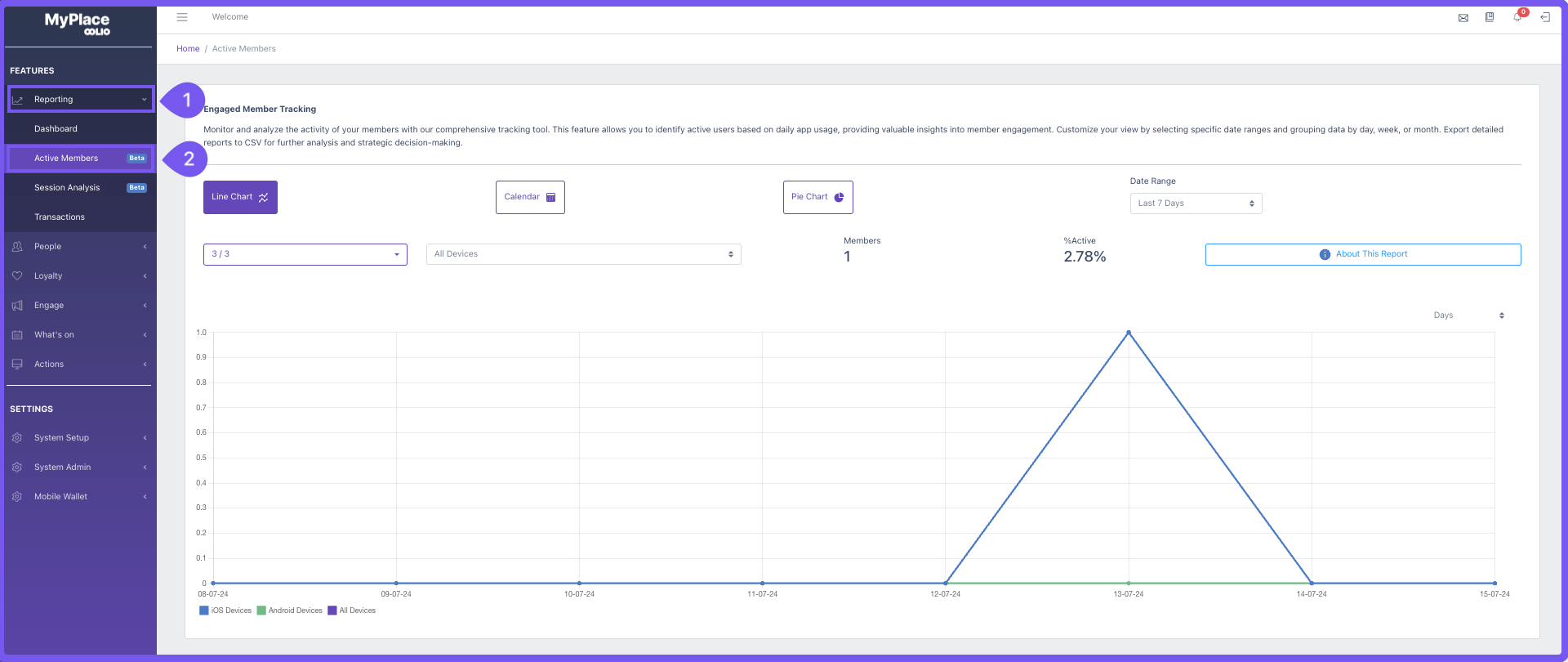
The chart features an x-axis with labeled dates categorised by days, weeks, and months within the defined date range. Inside the graph, three lines depict the usage of various device types by active members. This setup allows for comparisons between IOS and Android users, as well as provides an overview of the total number of active sessions overall.
Filtering Options
Filtering options in charts refer to tools or features that allow users to refine the data displayed in a chart according to specific criteria.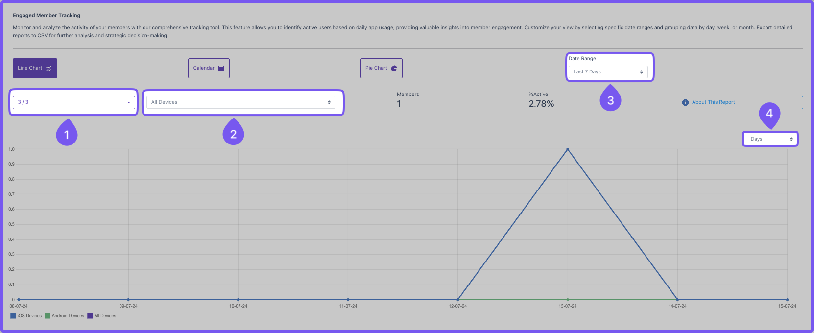
1. Member Tiers
By default will be set to All members, When the dropdown field is clicked, it will display all tiers set up in Myplace. Users can click each desired tier and the chart will update to only include the tier selection. This is useful for understanding, which tiers a regularly using the app and can aid in providing more incentives to tiers that req
2. Device Type
By default this will be set to All devices. This dropdown field allows users to filter by device types. This is helpful in understanding the member base and what is the more popular devices being used with the app. This can also aid in understanding if there might be underlying problems within one of the platforms e.g. App crashes or App freezes.
3. Date Range
This allows users to select the date range of the chart. The chart will update automatically to match the date range. There a 5 options:
- Last 7 days
- Last 30 days
- Last 60 days
- Last 90 days
- Custom range - Two fields will appear for users to select the start date and end date of the desired period.
4. Chronological view
A filter that allows users to section the chart using days, weeks or months
Key Metrics
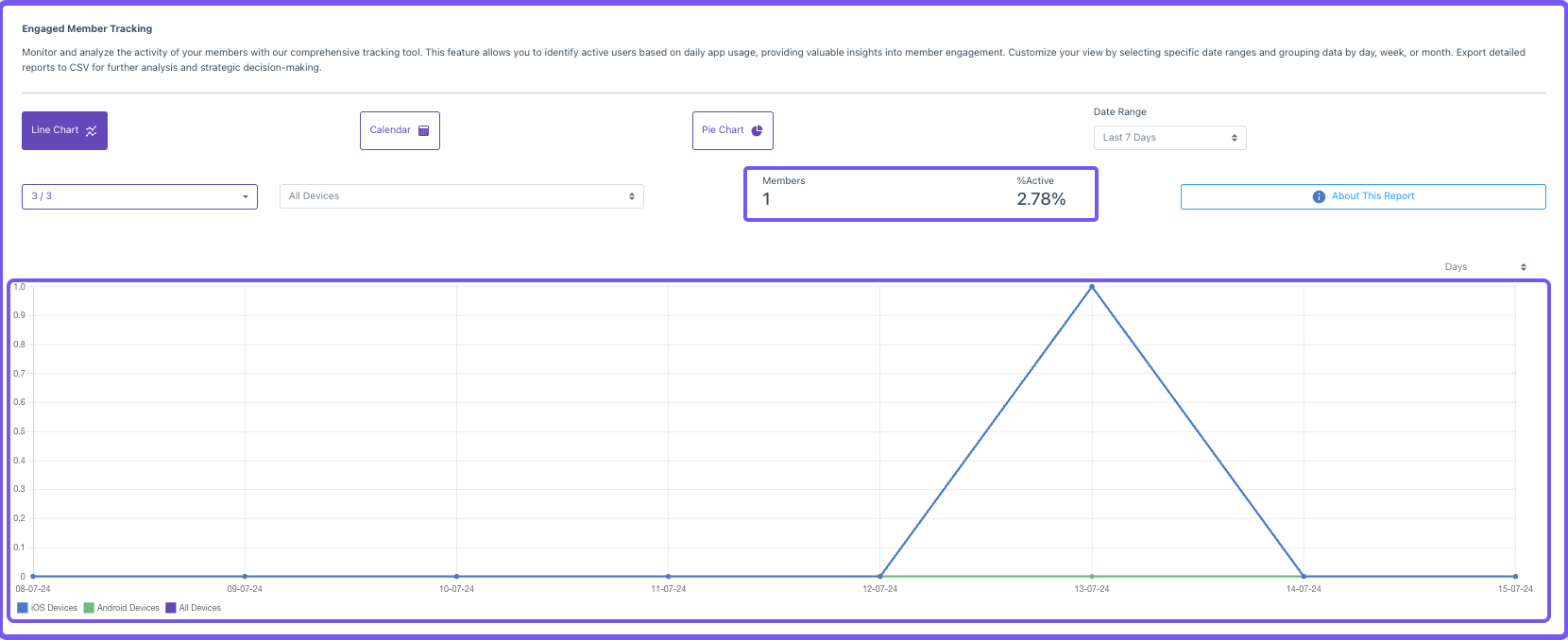
Members
This displays the total amount of active members within the set date range period.
%Active
This displays the percentage of total active members from the overall total members in myplace
Chart
Illustrates the fluctuating count of active members over a specified time frame through a line graph visualisation