
- INTERNAL - Bepoz Help Guides
- MyPlace | myPLACE Lite
- myPLACE Lite | BackPanel Guides
-
End-User | Products & SmartPOS
-
End-User | Stock Control
-
End-User | Table Service and Kitchen Operations
-
End-User | Pricing, Marketing, Promotions & Accounts
- Prize Promotions
- Points, Points Profiles and Loyalty
- Product Promotions
- Repricing & Discounts in SmartPOS
- Vouchers
- Account Till Functions
- Pricing, Price Numbers and Price Modes
- Raffles & Draws
- Marketing Reports
- Accounts and Account Profiles
- Rewards
- SmartPOS Account Functions
- Troubleshooting
- Product Labels
- Packing Slips
-
End-User | System Setup & Admin
-
End-User | Reporting, Data Analysis & Security
-
End-User | Membership & Scheduled Billing
-
End-User | Operators, Operator Permissions & Clocking
-
Interfaces | Data Send Interfaces
-
Interfaces | EFTPOS & Payments
- NZ EFTPOS Interfaces
- Linkly (Formerly PC-EFTPOS)
- Adyen
- Tyro
- ANZ BladePay
- Stripe
- Windcave (Formerly Payment Express)
- Albert EFTPOS
- Westpac Presto (Formerly Assembly Payments)
- Unicard
- Manager Cards External Payment
- Pocket Voucher
- OneTab
- Clipp
- eConnect-eConduit
- Verifone
- AXEPT
- DPS
- Liven
- Singapore eWallet
- Mercury Payments TRANSENTRY
- Ingenico
- Quest
- Oolio - wPay
-
Interfaces | SMS & Messaging
-
Interfaces | Product, Pricing, Marketing & Promotions
- Metcash Loyalty
- Range Servant
- ILG Pricebook & Promotions
- Oolio Order Manager Integration
- Ubiquiti
- Product Level Blocking
- BidFood Integration
- LMG
- Metcash/IBA E-Commerce Marketplace
- McWilliams
- Thirsty Camel Hump Club
- LMG Loyalty (Zen Global)
- Doshii Integration
- Impact Data
- Marsello
- IBA Data Import
- Materials Control
- Last Yard
- Bepoz Standard Transaction Import
-
Interfaces | Printing & KDS
-
Interfaces | Reservation & Bookings
-
Interfaces | Database, Reporting, ERP & BI
-
Interfaces | CALink, Accounts & Gaming
- EBET Interface
- Clubs Online Interface
- Konami Interface
- WIN Gaming Interface
- Aristocrat Interface
- Bally Interface
- WorldSmart's SmartRetail Loyalty
- Flexinet & Flexinet SP Interfaces
- Aura Interface
- MiClub Interface
- Max Gaming Interface
- Utopia Gaming Interface
- Compass Interface
- IGT & IGT Casino Interface
- MGT Gaming Interface
- System Express
- Aristocrat nConnect Interface
- GCS Interface
- Maxetag Interface
- Dacom 5000E Interface
- InnTouch Interface
- Generic & Misc. CALink
-
Interfaces | Miscellaneous Interfaces/Integrations
-
Interfaces | Property & Room Management
-
Interfaces | Online Ordering & Delivery
-
Interfaces | Purchasing, Accounting & Supplier Comms
-
SmartPOS | Mobile App
-
SmartPDE | SmartPDE 32
-
SmartPDE | Denso PDE
-
SmartPDE | SmartPDE Mobile App
-
MyPlace
-
MyPlace | myPLACE Lite
-
MyPlace | Backpanel User Guides
- Bepoz Price Promotions
- What's on, Events and tickets
- Staff
- System Settings | Operational Settings
- Vouchers & Gift Certificates
- Member Onboarding
- Members and memberships
- System Settings | System Setup
- Reports and Reporting
- Actions
- Offers | Promotions
- Messaging & Notifications
- System Settings | App Config
- Surveys
- Games
- User Feedback
- Stamp Cards
-
MyPlace | Integrations
-
MyPlace | FAQ's & How-2's
-
MyPlace | Release Notes
-
YourOrder
-
YourOrders | Backpanel User Guides
-
YourOrders | YourOrder Kiosk User Guide
-
YourOrders | Merchant App User Guide
-
WebAddons
-
Installation / System Setup Guides
- SmartPOS Mobile App | Setup
- SmartPOS Mobile App | SmartAPI Host Setup
- SmartPOS Mobile App | BackOffice Setup
- SmartPOS Mobile App | Pay@Table setup
- SmartKDS Setup 4.7.2.7 +
- SmartKDS Setup 4.6.x
- SQL Installations
- Server / BackOffice Installation
- New Database Creation
- Multivenue Setup & Config.
- SmartPOS
- SmartPDE
- Player Elite Interface | Rest API
- Interface Setups
- Import
- KDSLink
- Snapshots
- Custom Interface Setups
-
HOW-2
- Product Maintenance
- Sales and Transaction Reporting
- SmartPOS General
- Printing and Printing Profiles
- SQL
- Repricing & Discounts
- Stock Control
- Membership
- Accounts and Account Profiles
- Miscellaneous
- Scheduled Jobs Setups
- Backoffice General
- Purchasing and Receiving
- Database.exe
- EFTPOS
- System Setup
- Custom Support Tools
-
Troubleshooting
-
Hardware
4 | Mobile Wallet | IOS
This article offers a detailed guide on setting up backpanel configurations for the iOS member wallet feature in myPlace Lite. Prerequisite Bepoz Team Member will need to enable myPlace Lite feature IOS Mobile Wallet Member Card iOS Member cards are a valuable feature designed to enhance user convenience by enabling them to securely store their membership details directly within the iOS Wallet. This streamlines access to account information, ensuring it is readily available whenever needed.
This article offers a detailed guide on setting up backpanel configurations for the iOS member wallet feature in myPlace Lite.Prerequisite
- Bepoz Team Member will need to enable myPlace Lite feature
IOS Mobile Wallet Member Card
iOS Member cards are a valuable feature designed to enhance user convenience by enabling them to securely store their membership details directly within the iOS Wallet. This streamlines access to account information, ensuring it is readily available whenever needed. By integrating with the iOS Wallet, users can utilize their account information without the need to open the app, thereby simplifying their digital and physical experiences.
Additionally, iOS Member cards are integrated into Myplace Lite, further enhancing the user experience by eliminating the need to log in repeatedly to access account information.
IOS Member Card Designer
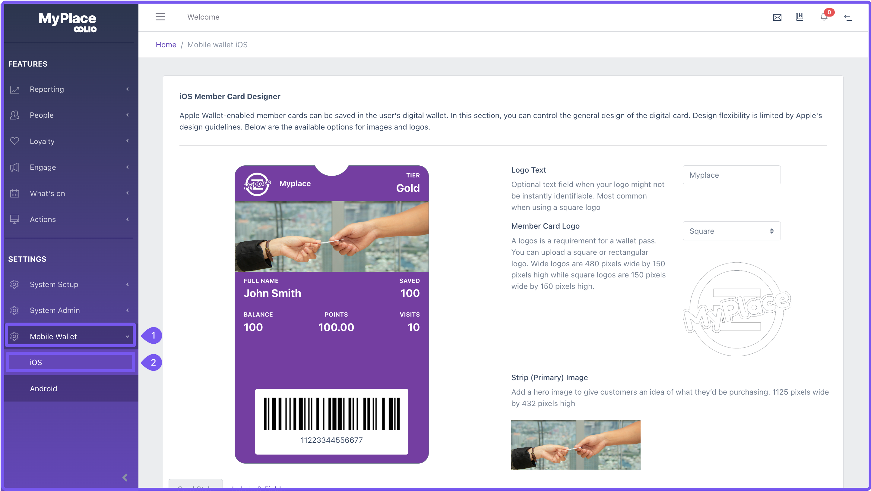
Within the backpanel there is a page for users to adjust the IOS member card design to their preferences. This is only shown on the sidebar when the prerequisites have been met. To access this page use the following steps:
1. Click 'Mobile Wallet' in the sidebar
2. Click 'IOS' in the dropdown drawer
IOS Member Card Designer Configurations
On the IOS member card designer page there are several fields as well as a preview of the card. As field values change the preview will update dynamically to match. Note that the values for Header, Secondary and Ancillary fields are only a example. The actual member card will be filled with the members information.
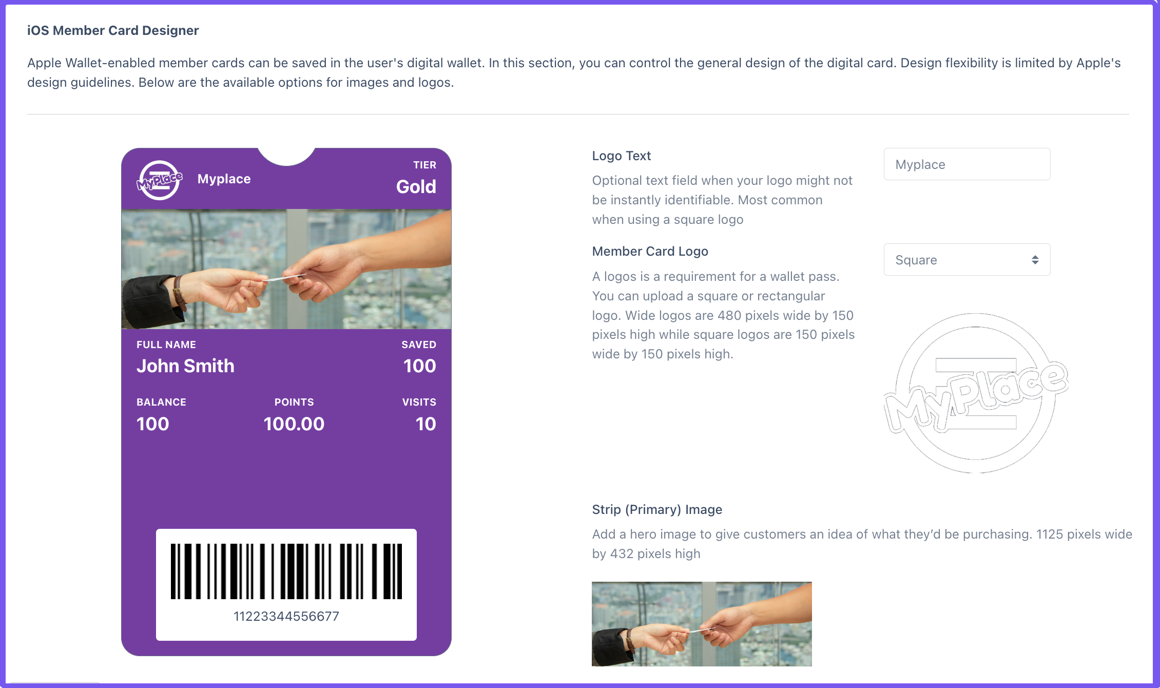
Primary Settings
- Logo Text: Allows you to add the business name as a title. Ideal for use with square member card logos.
- Member Card Logo: An image used for the business logo, available in two sizes.
- Square: Dimensions are 150 pixels by 150 pixels, suitable for use with logo text.
- Wide: Dimensions are 480 pixels by 150 pixels, recommended for use without logo text.
- Strip (Primary) Image: Optional image that can be displayed on the member card. Dimensions should be 1125 pixels wide by 432 pixels tall.
Card Styles
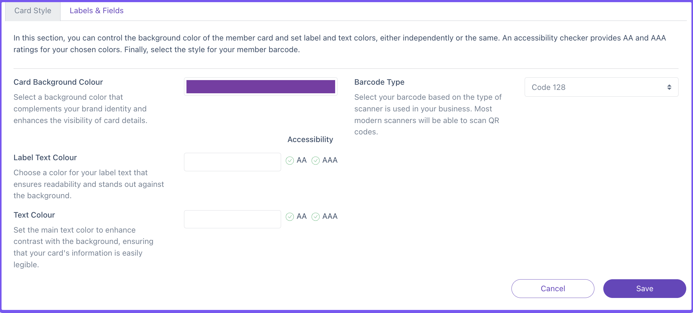
This tab allows users to change the colours of the member card and apply a barcode.
- Accessibility: This feature evaluates the contrast between text and background colours to determine the card's accessibility level. Once a sufficient level is achieved, a green checkmark icon will indicate compliance. The higher the level, the better the contrast and readability. The accessibility levels are as below:
- AA = Strong Accessibility
- AAA = Excellent Accessibility
- Card Background Colour: Sets the background colour of the member card. By default, it uses the hero colour fill. To change it, click the field and use the colour palette to select your preferred colour.
- Label Text Colour: Adjusts the colour of the labels above each field on the member card. By default, it uses the hero colour text. Click the field to open the colour palette and choose your desired colour.
- Text Colour: Specifies the colour of the text within each field on the member card. By default, it uses the hero colour text. Click the field, access the colour palette, and select the colour you prefer.
- Barcode Type: Selects the type of barcode to display on the member card. Options include none, code128, and QR code.
Labels & Fields
This section enables users to customise the information displayed on the member card.
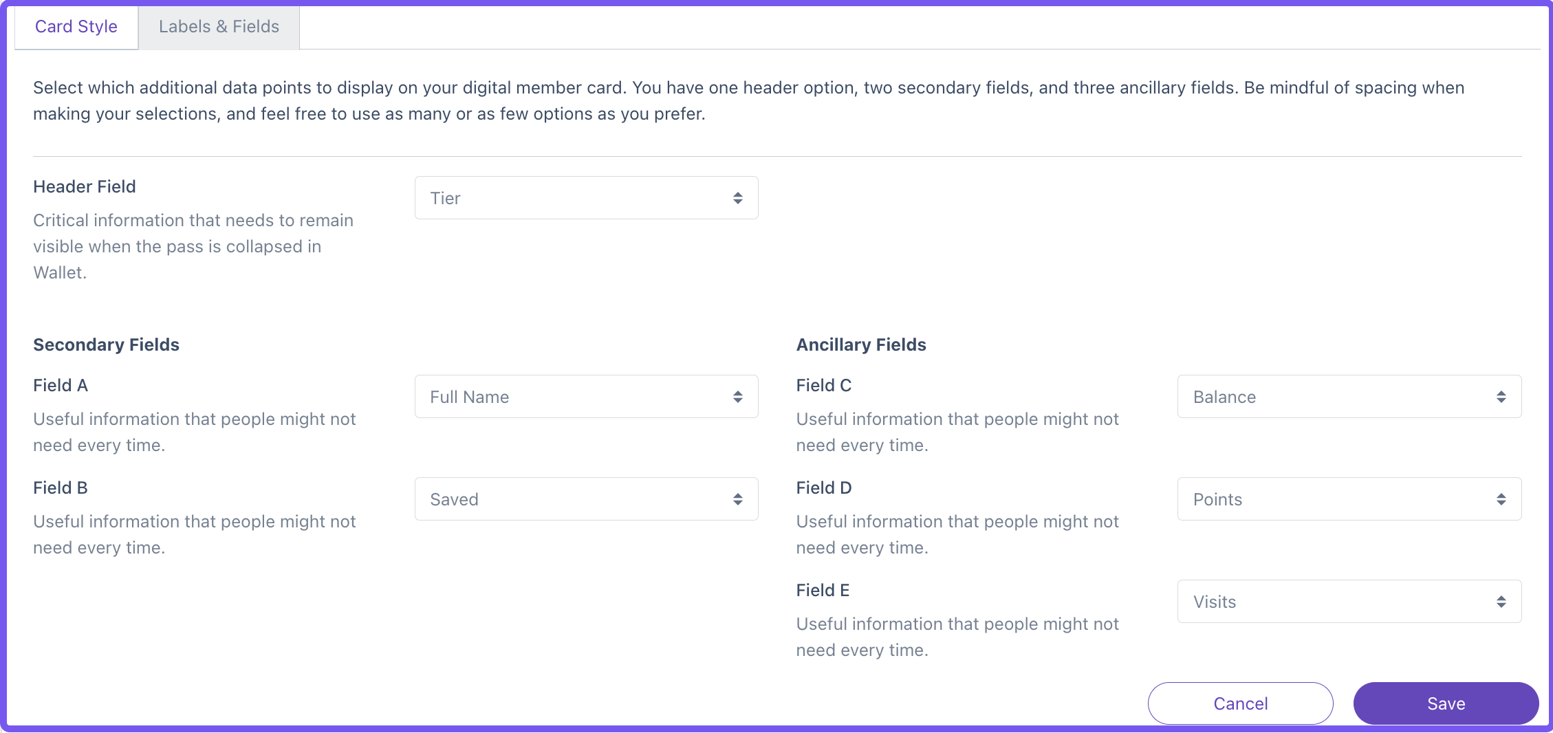
These fields are essential for adding crucial information to member cards, such as name, points, balance, or other relevant data.
- Header Field: Primary field positioned at the top right of the member card.
- Secondary Fields: First row of fields located beneath the strip image.
- Ancillary Fields: Second row of fields positioned underneath the strip image.
Once all fields are configured as desired, simply click 'Save' to update the IOS member card.